It has been designed to emphasize the
unique character of Green Agrotech
with a simple yet differentiated visual style.

CI&BI
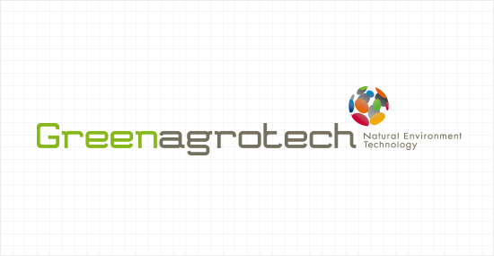
Green Agrotech
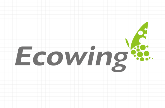
Ecowing
the infinite possibilities and eco-friendly agriculture
‘Green Agrotech’

+

+

This symbol design of various colors represents
the infinite possibilities of Green Agrotech for globalization,
and the ladybug, a representative image for
eco-friendly agriculture, implies the future of the
company and its objectives.
 Logotype
LOGO
Select from Type A, Type B, and Type C depending on the needs. Natural Environment Technology is less legible when the size of the CI is reduced significantly, so it is recommended to look for other signature applications.

A Type

B Type

C Type
COLOR PALETTE
This designated color is one of three important basic elements for creating the corporate image along with the symbol mark and logotype. The designated color is a means of clearly differentiating Green Agrotech from other companies by applying the color in a consistent manner, creating synergistic effects when combined with the image of the symbol mark
panton DS 295 - 1C
C50 M0 Y100 K10
C50 M0 Y100 K10
panton 417CVC
C50 M0 Y100 K10
C50 M0 Y100 K10
panton DS 200 CVC
C0 M100 Y65 K16
C0 M100 Y65 K16
panton 173CVC
C0 M69 Y100 K6
C0 M69 Y100 K6
panton 173 CVC
C0 M69 Y100 K6
C0 M69 Y100 K6
panton 130 2X CVC
C3 M40 Y95 K0
C3 M40 Y95 K0
panton 130 2X CVC
C3 M40 Y95 K0
C3 M40 Y95 K0
panton 116 2X CVC
C2 M21 Y97 K0
C2 M21 Y97 K0
panton 386CVC
C30 M0 Y94 K0
C30 M0 Y94 K0
panton 382CVC
C30 M0 Y94 K0
C30 M0 Y94 K0
panton 280CVC
C100 M72 Y0 K18
C100 M72 Y0 K18
panton 299CVC
C87 M18 Y0 K0
C87 M18 Y0 K0
panton 433CVC
C34 M0 Y0 K94
C34 M0 Y0 K94
panton DS 429CVC
C6 M0 Y0 K34
C6 M0 Y0 K34
Logo Application


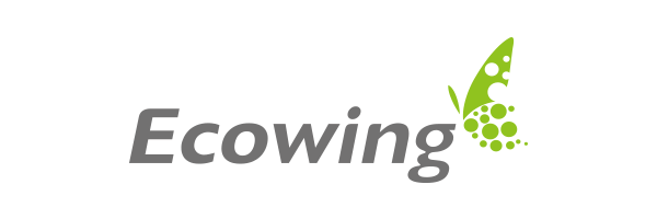
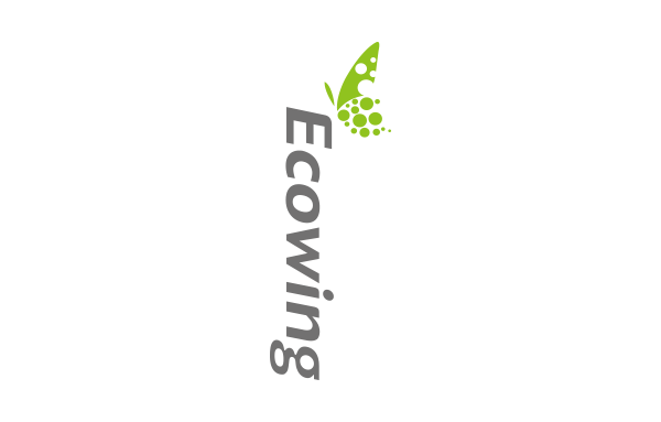
Eco-friendly wing, ‘Ecowing’

+

‘Ecowing’ is a brand of Green Agrotech for supporting
eco-friendly agriculture. Such a meaning is expressed
with the wings of a “butterfly”,
which connects nature and
nature,
and also the leaves that symbolize nature
with a
dynamic feeling.
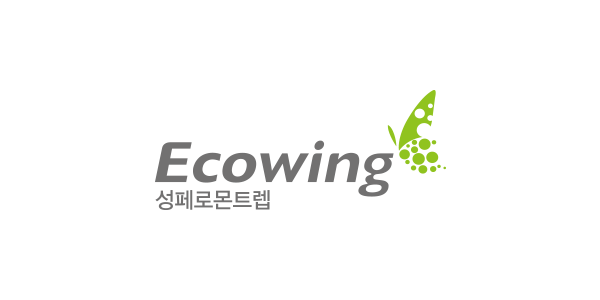
The ‘Ecowing’ brand of Green Agrotech is used as a
new marketing tool for the company as well as the
products such as pheromone traps, pollinating bees,
and light traps, which Green Agrotech is actively
promoting based on the specific ideology of
eco-friendly wings.
Logotype
The word mark should be reproduced in an accurate manner so
as to maintain visual uniformity depending on the conditions and
circumstances of application.
This is for the image of the logotype to be
delivered clearly and consistently and thus, in principle,
the word mark should be used according to the basic grid rules provided.
LOGO
As the word mark is a basic element of visual identity that makes communications clear, it is necessary to pay close attention not to randomly change the shape, thickness, proportion, letter spacing, etc.
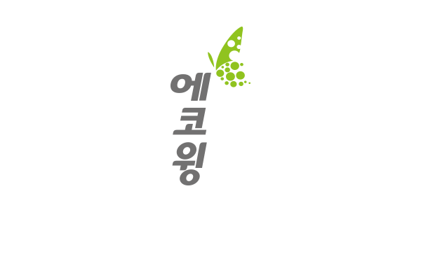
English

Korean
COLOR PALETTE
The color palette, applied to the various design media, forms the unique color image of the word mark as one of the important elements to deliver the original image of Ecowing.
For the most effective use of the color palette, the standard colors specified in this manual should be carefully maintained by reviewing the printing method, concentration of ink, material of paper, etc.
● MAIN COLOR

panton 379C
C50 M0 Y100 K0
C50 M0 Y100 K0
panton Gold
C27 M35 Y100 K0
C27 M35 Y100 K0
panton Silver
C45 M35 Y35 K0
C45 M35 Y35 K0
panton GRAY 11C
C0 M2 Y68 K0
C0 M2 Y68 K0

panton Black
C50 M0 Y100 K0
C50 M0 Y100 K0
Logo Application
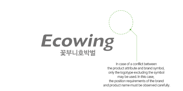
When indicating a product, the family brand and individual brand should always be positioned together, and the structure of positioning may be adjusted depending on the functionality, usability, and specificity of each product. The logo can be used appropriately depending on the application situation while maintaining the consistency of the brand.
English
Korean
Brand Positioning1
Brand Positioning 2